

| Posters are awful. Here's why. - 2014, July 17 | / ARTS |
Magazine covers, book covers and movie posters have suffered a serious decline in quality over the last 20-25 years. Why is this?
This ~2002 article by Coury Turczyn described the death of magazine cover design:Today, the art of the magazine cover has been vanquished by celebrity worship and bad taste. Designers are simply fulfilling the dictates of their industry, not unlike the paint person on an auto assembly line. Innovation, creative expression, or even cleverness has been mostly abandoned. Artistic considerations are limited to how much retouching the celebrity headshot requires in Photoshop and how many headlines can be crammed in before the cover looks too "busy." The result: A world in which it's difficult to tell the difference between Playboy and Harper's Bazaar without cracking them open.Coury posts some examples to illustrate. See page 1, page 2 and page 3. Below are some depressing samples from his 3 pages: 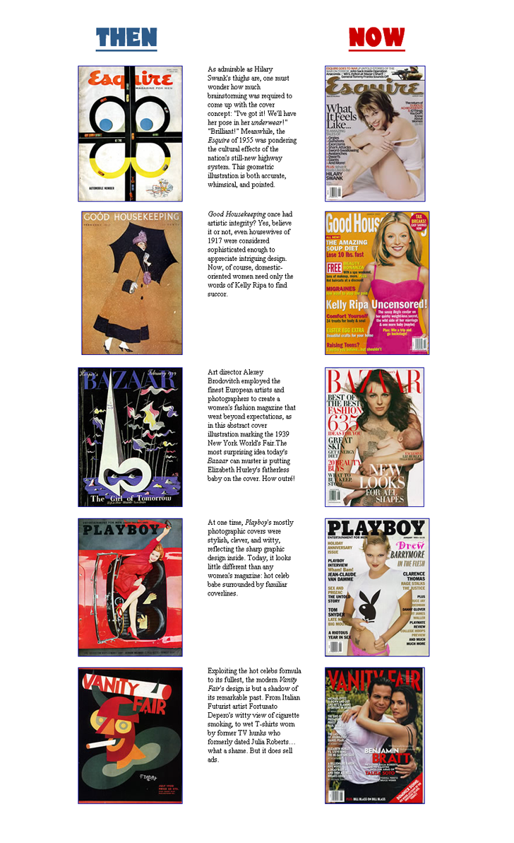 Today, you'd search in vain for a magazine that commissions covers like those. The best-designed mass circulation American magazines today - Details, GQ, Vanity Fair and, yes, Esquire - usually feature a really good photograph by a really good photographer of someone who has a new movie out, surrounded by handsome, often inventive typography. The worst magazines have a crummy picture of someone who has just been through some kind of scandal, surrounded by really awful typography ... today I also think that there is simply a general distaste for reckless visual ideas.Back to Coury: Why has the mainstream magazine publishing industry come to this artistic nadir? Publishers would tell you that the only way they can compete with television and the Internet is through the magic drawing-power of celebrities. When faced with a choice between an illustrated cover or Julia Roberts, consumers will pick Julia every time, they say. Publishers may be right–but why did uninspired shots of celebrities promoting their latest products become the only answer? Why did putting almost the entire contents page on the cover become required? What's worse about these simple-minded solutions is that not many designers or editors trouble themselves over the inherent esthetic failings–this is the only way they've ever known magazines to be, so how can they be any different?Neither passage explains why the decline happened when it did. First, some biographical data. My animation career began in 1988. I was hired by Don Bluth's Dublin studio, and worked there for 5 years. Though computers were then playing a limited role, the future of hand drawn animation seemed safe. 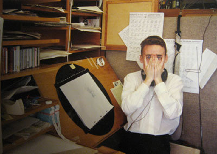 The author. Younger, thinner, but not wiser. Bluth had recently created 'An American Tail' and 'Land Before Time' (made in collaboration with Spielberg). Don's first feature 'The Secret of NIMH' was a commercial disappointment, but critically successful. This was how a creative environment should be run, it seemed. Creatives, whether of the Don or Spielberg mold, made the big decisions. And when they wanted a poster, they'd hire a Drew Struzan. 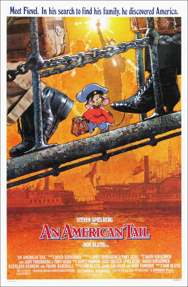 That poster is everything that modern ones aren't. Appeal. Clean diagonal composition. Depth. Masterful yellow-orange-red background, contrasted with grey/blue foreground. Tonal contrast between foreground and back. Clean negative spaces. Texture. In one image the protagonist, a little guy against a big world, embarking on the Hero's Journey. Behind him lies the entire continent, waiting to be explored, with the promise of triumph (Liberty) on the horizon. In little more than a decade, posters like this vanished almost entirely: Although that video shows a family of rote designs used by movie posters today, it really boils down to this formula: Take head shots or generic poses of the cast and crudely arrange them in scale to their salaries and/or reputations. 'Little Fockers' isn't even trying. It's a tarted-up imdb page. 'The Family' is a punch to the cornea. Whoever made 'American Hustle' must have shares in a black ink factory. 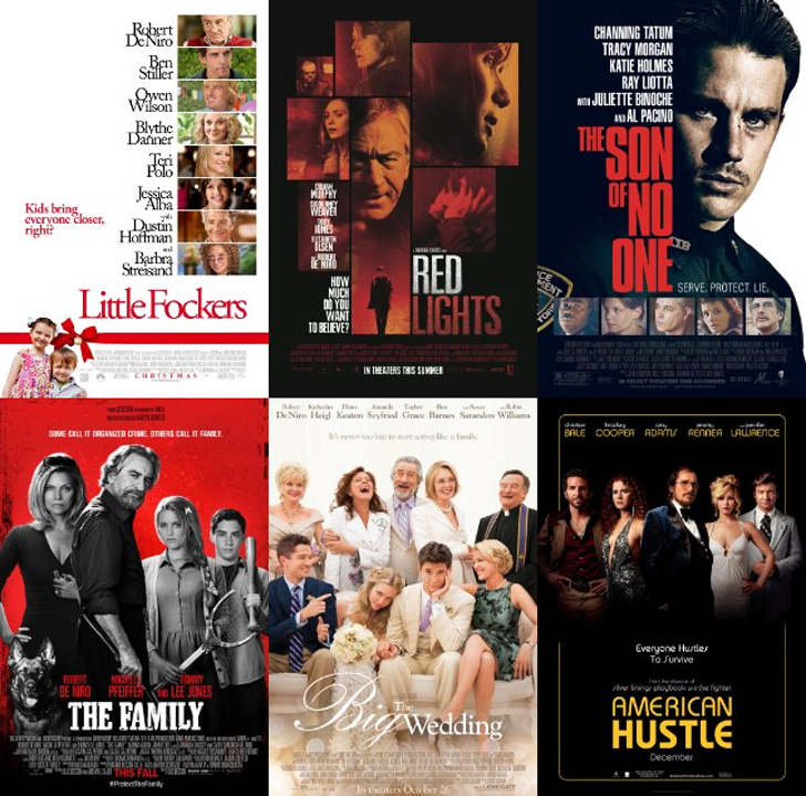 In 'The Family', De Niro seems to grow out of Pfeiffer's side like a conjoined twin. Note the inclusion of the dog! squished in to the bottom left. Shocking that they left out the gaffer and the best boy. How long before movie posters include the food truck? This isn't design: it's the jerry-rigging of head-shots or poses of the major cast members. The audience, regarded as simpletons, has to say "Oh, it's that guy!", or "He's the guy from that thing with the other guy you know the one from that show that you like..." etc. The situation is beyond parody, when a 5x6 grid constitutes the final product: 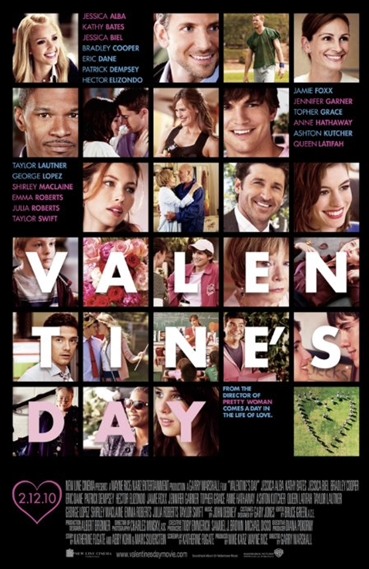 The instructions given to the hapless "OK, we have an ensemble cast of stars, we want them all on the poster".Diagonal or triangular compositions? Good enough for Gustave Doré, Frank Frazetta, or Leyendecker, but not good enough for Bob Barnaby from Marketing, Joe Ferguson from Accounts, or Liz Barnacle, Deputy Head of Synergy. These techniques are no longer 'fit for purpose' or 'best practice', 'going forward'. These corporate drones, the accountants, synergists, fakers, flakers, managers, spivs, skinnerbots, dandybags, flimflams and marketing drones will henceforth be referred to as "bean-counters". And they are in total charge now: "We've got De Niro, and we need his big warty face to fill as much of that poster as we can stomach. Show them his nosehairs. Have him break the fourth wall. Make sure he pops, but keep it edgy."They can afford De Niro's massive salary, but they can't afford to shave off a few grand to hire a half-decent designer, and trust him or her with a brief? What happens if you hire a first rate illustrator and ask them to design a poster, and follow the typical production process of 30 or 40 years ago? What happens (absent too much bean-counter nit-pickery) are these: 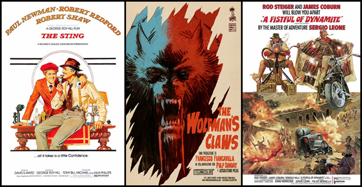 'The Sting' - elegant; it's like a Leyendecker painting (as the movie is set in the 1930s, the period in which Leyendecker was himself at his peak). 'The Wolfman's Claws' - 'A Fistful of Dynamite' - a ridiculously baroque composition, impossible to achieve with any grace when bolting live action images together in Photoshop. The comic rendering of the heroes matches the tone of the movie. Or these: 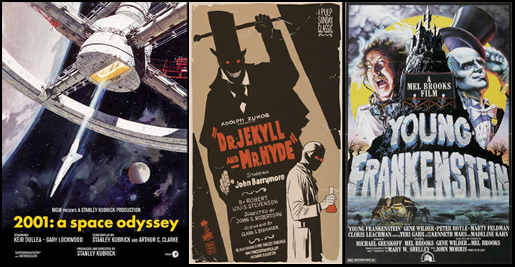 '2001' - A former boss used to have this hanging in their studio. Impossible not to be mesmerized by it. Strong diagonals, simple colour scheme, though it contains a lot of detail, the composition is fundamentally simple. It sucks you in. 'Dr. Jekyll and Mr. Hyde' - Shadows. Fancy that! Lighting? When did they invent that? Oh yeah, the 1920s. As mentioned above, Hyde is actually a modern poster using retro design styles by Francesco Francavilla. Still, shows a good design is still possible! 'Young Frankenstein' - Composition is a bit squished for my tastes, but the soaring triangular mountain/castle, Gene Wilder's mad face, and the fog-shrouded bodysnatchers at the base always make me want to to watch the movie (for the eleventeenth time). Or these: 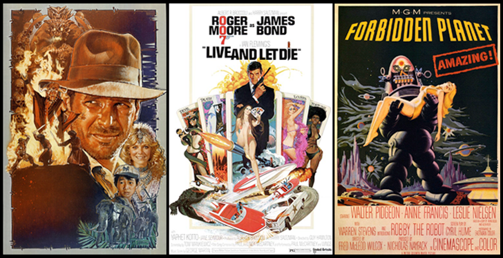 'Indiana Jones & the Temple of Doom' - Drew Struzan again. He makes the group composition look easy. This is a healthy application of a blue/orange colour scheme. 'Live and Let Die' - A bit cluttered, wouldn't consider this a classic, but even a sub-par poster pre 1994 far outclasses any of the photoshop horrors you'll see elsewhere on this page. And it has the virtue of 'What you see is what you get'. 'Forbidden Planet' - Again, not a first rate design, but it's simple, uncluttered, and iconic. You've seen the poster, now watch the movie. So much for the Good. Now back to the Bad and Ugly... To illustrate how fundamentally incompetent modern posters have become: One of the most basic errors of design is the tangent. Allowing two separate design elements to graze one another creates an ugly, confusing region. In the 'Valentine's Day' poster, note the squares containing letters. Each contains at least one tangent, where the actor's face is squished up against the letter. Looking at the child's face in the 'V' square leads to the conclusion that the tangents were deliberate in this case! Someone clearly thought that they were a good idea! 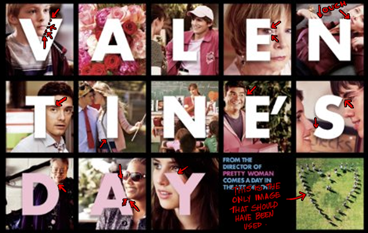 This would be a great poster for 'Migraine, the Movie', or the sequel, 'Migraine 2: Grand Mal Seizure'. Only a few of the tangents are flagged - see if you can spot more. The photo in the bottom right (the people in the shape of a love heart) would have made a better poster design by itself: at least it tries to make a statement, and is graphically simple. Instead, it's used as a period. Other principles of good design are negative space and silhouette. Never clutter the image by filling every space with detail: the areas around the character should have simply-shaped regions free of content. This creates texture, and allows the eye a restful place, a contrast. Another principle is 'line of action' - a strong, dynamic pose...as opposed to the static, vertical pose that most posters use. Each walking figure has a strong line of action. The 'American Hustle' poster is a great example of dull poses devoid of this principle, and of life. Shop-window manikins have more vitality. 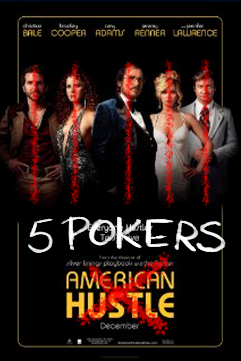 None of these basic principles are correctly applied in any of the movies above. The posters were chosen at random; no effort was made to find 'the bad ones'. They are typical. What would happen to a 'Jaws' poster, were it made today? 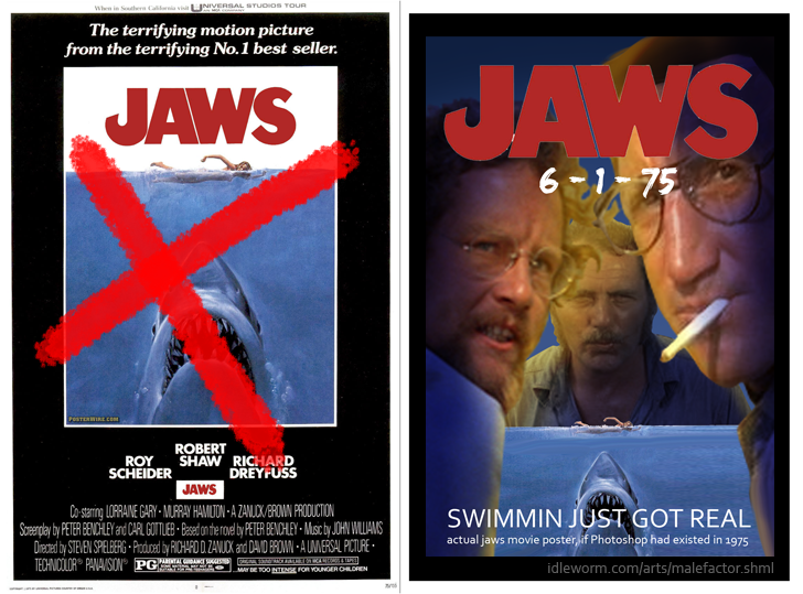 The modern 'school' of poster design doesn't understand the meaning of the word 'iconic'. Think: the cracking egg in the 'Alien' poster, for example. As an exercise, imagine what the studios would do with the Alien poster, were it being made today. HINT: look at the modernised 'Jaws' poster, above. As with the 'improved' Jaws poster, colour schemes are now bathed in a blue-orange vomit. In the samples below the hue of many of the oranges and blues is identical (compare 'Jumper' with 'Bourne Identity'). Even the blue/orange palettes have been reduced to a very narrow band - no doubt dictated by the studio's marketing/research department. I'll bet my Carter era bell-bottoms that the studio orcs hand out a 'style sheet' with the 'correct' values of blue and orange to the poor hobbits who toil in their design dungeons. They must stay 'on brand' at all times. NOTE: If you ever use the phrase 'on brand', follow with 'my precioussss'. Just as 'nobody ever got fired for buying IBM', no bean-counter ever got fired for ordering a blue-orange poster with ugly, generic poses: 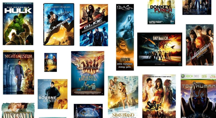 There has always been a tension or struggle between artists and bean-counters. That isn't new. But who or what are these counters of beans, and whence comes their power? Bean-counters are creatures who have never bothered to study the principles of art, but who fancy themselves as creative. However, instead of spending years studying design, colour theory, anatomy, art history, design history, composition, rabatment, counterpose or line of action, they play-act at being a 'creative' and impose their hack aesthetic on actual artists - to the extent that they can get away with. What does it look like when a person intrudes on a discipline for which they have no qualifications? Having seen it first hand in animation: 1. They learn a few buzzwords and catchphrases. "Make it edgy". "Give it more tonality". "Make the colours pop". "Break the fourth wall". "Add a moving hold". Even if the words have a technical meaning (tonality) it's often used in a way that is meaningless. New buzzwords and catchphrases appear ex nihilo and spread through the massed ranks of bean-counters like herpes. 2. The hack-fad. They find a couple of little graphical tricks (such as the blue/orange colour scheme), and instead of applying them judiciously (as in the 'American Tail' poster), they reduce them to formula and splatter them across all posters of a given genre, because they are incapable of any visual boldness or originality...or creativity. How could they be? The only truly creative decision that they are qualified to make is how to name the columns in an Excel spreadsheet, and how to justify the firing of a 20 year employee 4 weeks from retirement. That fact doesn't stop them from blundering into the designers' China shop like a hippo with blistered hemorrhoids. In the good old days (pre ~1994), artists could push back somewhat and limit the damage.That tension no longer exists. ALL control of the design process has been lost by actual designers, and is now entirely in the hands of the bean-counters. So what was the precise mechanism that allowed bean-counters to take over? Theories about a dislike of big ideas (Bierut) or celebrity worship (Coury) or a lack of money and time (goodbadflicks) don't account for the fact that all those factors existed in the 60, 70s, and 80s, in abundance - and those decades somehow managed to push back and produce many great and good designs along with the bad. What is the secret weapon in the arsenal of the talentless?  Toot-toot-de-toot-tood-de-dooo: Adobe Photoshop. Photoshop was created in 1988 by Thomas and John Knoll. Since then, it has become the de facto industry standard in raster graphics editing, such that the terms "photoshopping" and "photoshop contest" were born.The early versions were primitive compared to what was to follow. The real power came in 1994, when Adobe added layers, which allowed the artist to have one layer for the background, another for the title, and others for character layers or effects. Thus, the artist could nudge a character into a different position, rotate it, or scale one up, another down, easily and quickly. In the past, even minor changes would have taken hours or days, and involved physically scraping paint off a board or page, and would have entailed a price tag. But with Photoshop, layers could be brightened, colours could be changed, opacity, contrast, saturation all could be modified in seconds. Our hypothetical designer in 1985 was painting (with paint or ink) on paper, canvas or board. Or, he/she was creating a photographic composition using analog techniques, working in a darkroom (DO NOT OPEN THE DOOR, YOU IDIOT). There were fewer points in the traditional process where witless and arbitrary changes could have been freely made by artless cretins. The job required arcane abilities (Hey bean-counter, do you know how to scumble?). Even small changes ("Can you make his head 10% bigger?") carried a penalty when the image was painted on a physical surface. "Yes, I can make his head 10% bigger. How does next Thursday sound?" "Oh, never mind, it looks great as it is". Fast forward 20 years, and the relationship has transformed: No longer is the artwork on paper, it's digital. Multiple versions can be saved. The image is on layers. Changes can be made for 'free' by any opinionated bumbleduff in a suit. Once the bean-counters realised that they could stand behind the artist's shoulder and issue commands, we entered the age of pixel-pushing. The artist/designer no longer has any real autonomy as final decisions about tones, saturation, and composition were ceded to bean-counters who have little knowledge of the concepts, beyond the crudest level. Worse still, this process of bean-counter approval is often done by committee. There's only one thing worse than a bean-counter with delusions of creative grandeur: a room full of bean-counters with delusions of creative grandeur. They all have their tuppence haepenny's worth of wisdom - and everyone must have their input, in proportion to their status in the corporate sewer / cubicle hellhole. In addition, the one-size-fits-all program (Photoshop) imposes its own aesthetic, especially in the hands of an unskilled user. The same happens in animation, when a cartoon is said to 'Look Flashy'. CGI animators can often tell which render engine was used on a specific movie, as there's a 'Maya look', a 'Lightwave look', and so on. This cannot occur when an artist works directly on canvas, paper or board, with brushes or pens, because there is no electronic mediator between the artist and the image. Compare these wonderful hand-painted covers from low budget pulp magazines with the generic trash churned out for multi-million dollar features today: 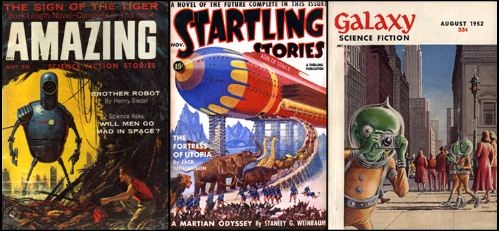 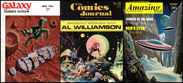 Though the digital tools are great to have, unless the artist or animator forces their style upon the program, the program will impose its style upon them. It is difficult for a skilled artist to achieve this - for a bean-counter it is impossible. Design has now become an exercise in gilding bean-counter stools. Once total control of the design process passed to bean-counters, it created a negative feedback loop. There was no apparent penalty for this method, and the public continued to buy movie tickets or magazines. The expectation that a certain level of design competence was required unconsciously began to fade. Bean-counters couldn't resist the temptation to meddle further, and the process fed on itself catabolically: if the final work was going to be determined by the tastes of a bean-counter, then why hire a Drew Struzan at all? Get an intern or a recent school graduate who knows how to use Photoshop, and bully them to execute your bean-counter vision. Now you, the bean-counter technocrat, are transmuted into the True Artiste. Imagine the delirium the bean-counter must feel as they 'design' the poster or magazine cover. They win a few precious moments away from their dreary excel spreadsheets and powerpoint slides, and get to live that alternate life, the one they really wanted but for which they lacked the talent. If only Mommy and Daddy had let them go to Art School instead of that awful Business Management course! The actual art school graduate who put in the effort to learn their craft is a meat puppet to them. A spine, a brain stem, and a hand attached. The bean-counter shouts orders down the neck stump, and pictures appear on screen as if by magic. "Move Vin Diesel's head to the left. Make it 10% bigger, add the blue orange tint, going forward! Make his face pop!"What bean-counter is going to give any control back to the designer? It's not going to happen. Liberties aren't given, they're taken - and that liberty got taken away 20 years ago. There is no mechanism that I can imagine for a studio artist to recover it. This oatmeal cartoon illustrates that the same process even happens at the small scale, with clients who use the artist/designer as "a mouse cursor inside a graphics program which the client can control by speaking, emailing, and instant messaging." And yes, I've had a client (a lovely lady) who had this exact relationship with me. Hire an animator with decades of experience, but don't trust them to animate the project. Instead, sit over their shoulder and use them to push the images around the screen, to wherever you decide. The final result of such practices, whether for book covers, magazines, movie posters, animation or websites is as predictable as it is horrible: 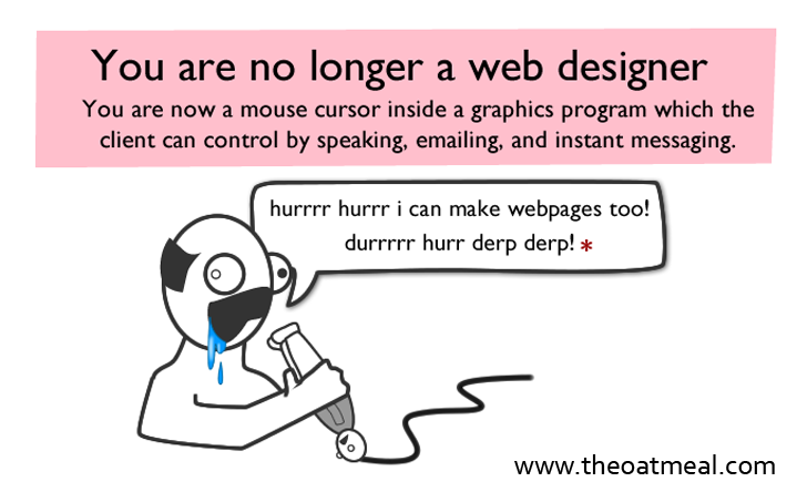 Ghastly things are happening around the globe now (aren't they always?) - so all of the above qualifies as 'First World Problems'. Be grateful that the same process doesn't happen with doctors, who at least have final say over your health...waaait a minute! What the? A similar process is happening in Western health systems, as power is transferred to insurance companies (bean-counters) and employers (bean-counters), as well as various bureaucratic abominations (e.g., the HSE bean-counters in my home-country, Ireland). The result on quality of care for patients when decisions are driven by bean-counters is as predictable as the quality of artwork when designed by same. The seizure of power by technocrats is a theme of John Ralston Saul's 1993 book 'Voltaire's Bastards'. Many of the trends he identified have worsened since then. Amazon link. The book ...argues that the rationalist political and social experiments of the Enlightenment have degenerated into societies dominated by technology and a crude code of managerial efficiency. These are societies enslaved by manufactured fashions and artificial heroes, divorced from natural human instinct.A similar rot infests architecture, journalism, writing, politics, and other areas. Where will it end? There seems to be a drift towards a contempt for excellence, a dumbed-down worship of the banal or third rate, and rule by bean-counters. Hopefully the aqueducts can be kept working, at least until king Theodoric arrives. I do miss good posters, nice magazine covers, eye-catching books. It was fun in the previous century to pick up a novel and see that an attempt was made to create an engaging design. "You don't miss what you never had", so young 'uns today may be unaware that something has been lost. But old farts who remember the past know better. I've been asked for an example of a good recent poster. To show that it can be done, even with a tiny budget on a knowingly cheesy movie, here's the poster for the low budget Australian B-movie '25th Reich' - the movie had little over $1 million to spare, yet they were able to create an old school poster design: 
In a future post, I will reminisce about experiences while working on interactive animated projects in the dot.com frenzy of the 1990s - which were my first exposure to this Brave New World. There are amusing stories to tell. Whether or not this account is written depends on how many people read this piece. So: comments powered by Disqus |